Comparing: ClickUp, Asana, Trello, Zenkit, Airtable, Milanote & Quire
Table of Contents Show
There are SO many Project Management tools out there that are worth a look, but which one is the right fit for YOU?
I’ve taken the time to break down the ones I’ve used & organize them into feature lists so you can search for what you need and see which apps offer those things.
Now, let’s see which app is the right fit for your productivity needs!
Project Management Tool: a features roundup
I spent a few hours compiling a list of features for these 6 major project management tools I’ve actually used before:
ClickUp
Asana
Trello
Zenkit
Airtable
Milanote
Quire
Since ClickUp was what I was using at the time of posting, I based the structure of the organization around it, because it seems to have the most amount of features available for the price. Since then I switched back to Asana, then to Notion, then to ClickUp, and back to Notion, then added Airtable. 😂 –It’s been so hard to decide!
The names & descriptions are mostly specific to ClickUp, but you can sort the chart by brand/app to see which apps offer what, based on information I’ve collected from their websites.
This is NOT an end-all-be-all list. This is the most comprehensive list I could put together in a few hours, only dealing with apps I’ve used myself. All of the features I’ve added to this came from the app websites, specifically their features list pages.
Some brands share a more extensive amount of information than others, and because ClickUp’s site shared the most amount of information, this list highlights it most often.
Paid features
I only marked it on the list when I knew without a doubt, it’s a paid feature.
The items marked as paid features are not the only features on their paid plans, though. I’m sure there are more that are not marked, which just means the website didn’t explicitly state that it was/wasn’t a paid feature.
👉🏻 If you see something you think I should edit in this spreadsheet, leave a comment below! I am, after all, striving for accuracy here.
Basic Feature Comparison
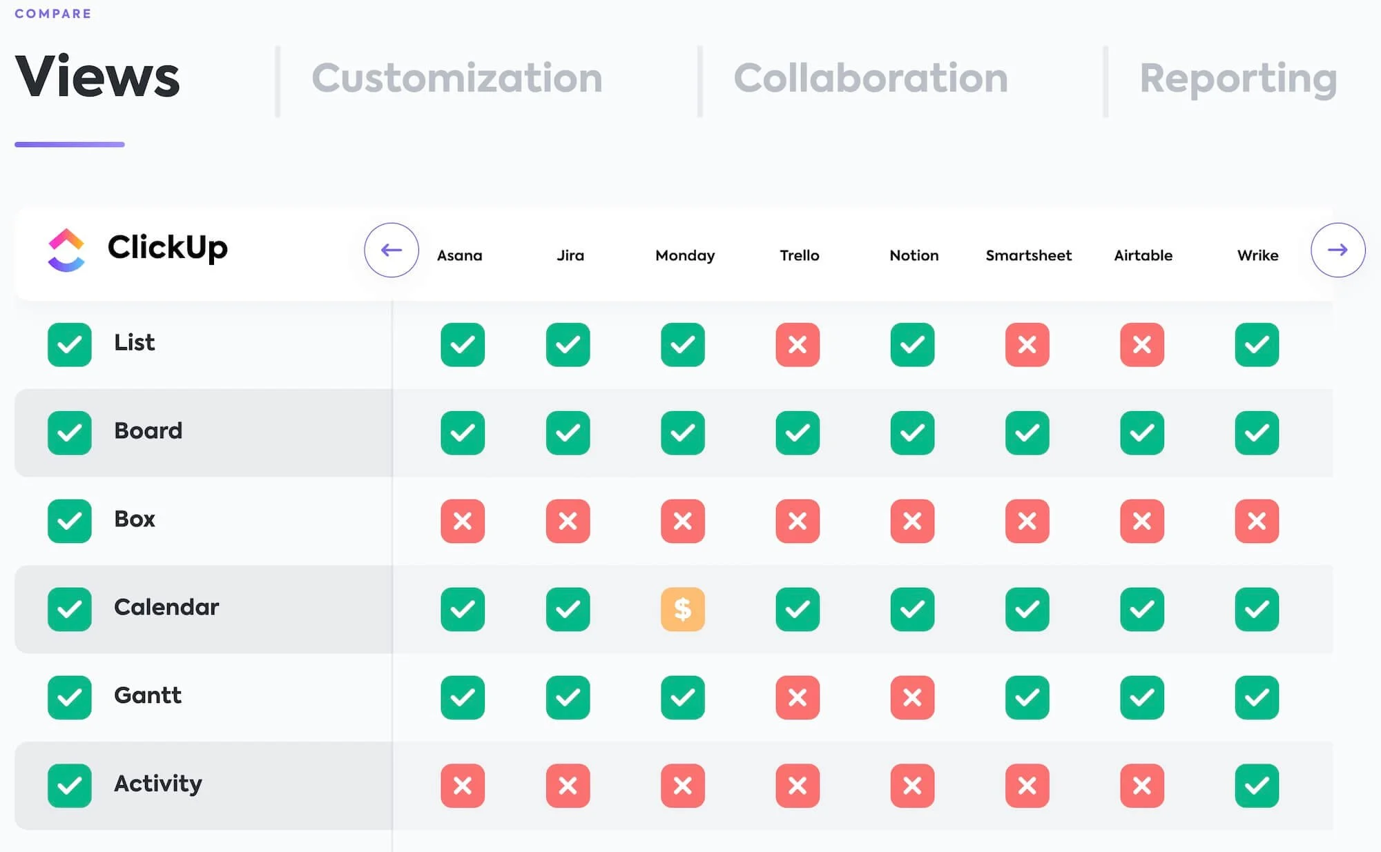
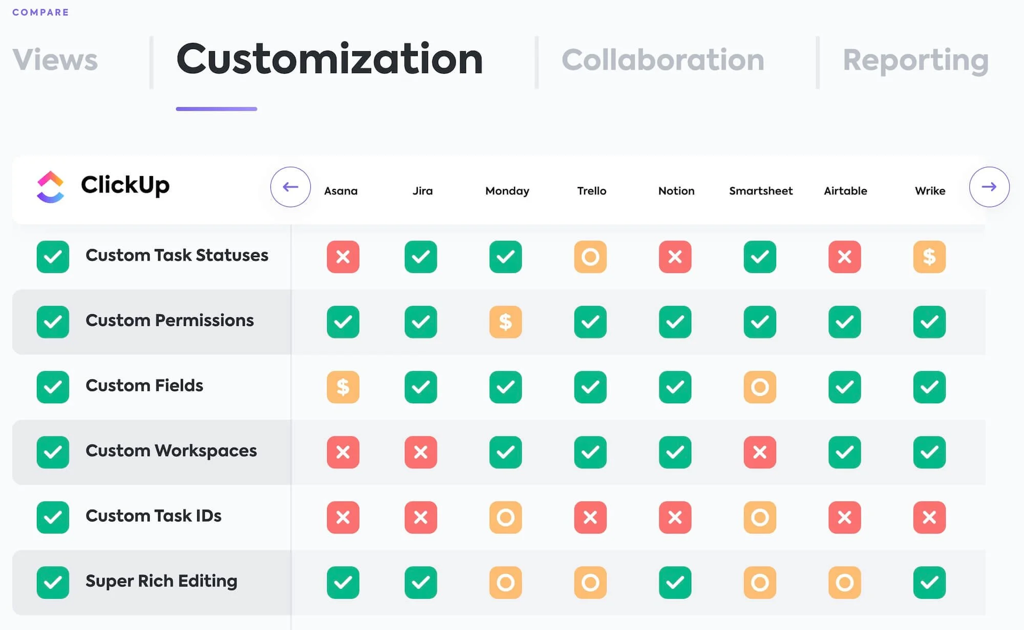
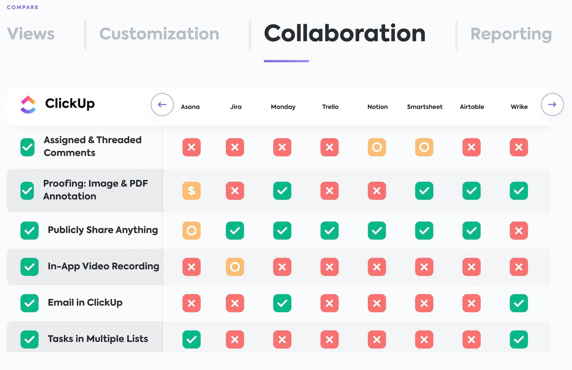
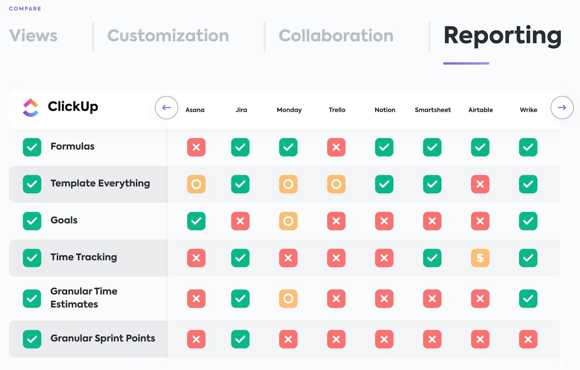
To see a basic, interactive list of features across multiple PM tools, you can find ClickUp’s simple, easy-to-read chart here and click on the purple arrows in the top right to see even more tools listed like ToDoist, Basecamp & Teamwork. Just take their chart with a grain of salt, because after all, they ARE biased toward their own platform. 😉
My experience
Here’s what I know, from my own personal experience using these apps. (Only going into the most detail, with the two I’m personally most comfortable with.)
Asana
I honestly hadn’t logged into my Asana account in a few years when I originally wrote this post.
Funny thing happened though. I logged in during April 2020 after I’d decided I really wanted to finally give up on ClickUp. After logging back into Asana & taking a peek at some things that have changed since I last used it in 2016, I decided to move back after having used everything else in this list.
ClickUp just never ‘clicked’ (ha-ha) for me, and Asana was SUPER easy for me to pick up, in comparison.
They’ve updated a lot of things since I last used it in 2016, so it’s not overwhelming for me at all now. In fact, I’d argue it’s one of the easiest to pick up, –one of the most robust options that’s also easy to pick up, –at that.
They do have an app for desktop & mobile, so you can edit in detail or on-the-go easily.
LIMITS
It does require a paid plan to get some of the better features in it & upgrading is definitely expensive, but their free plan is all you’ll need in the beginning, which comes with the standard List View, Board View and Calendar View.
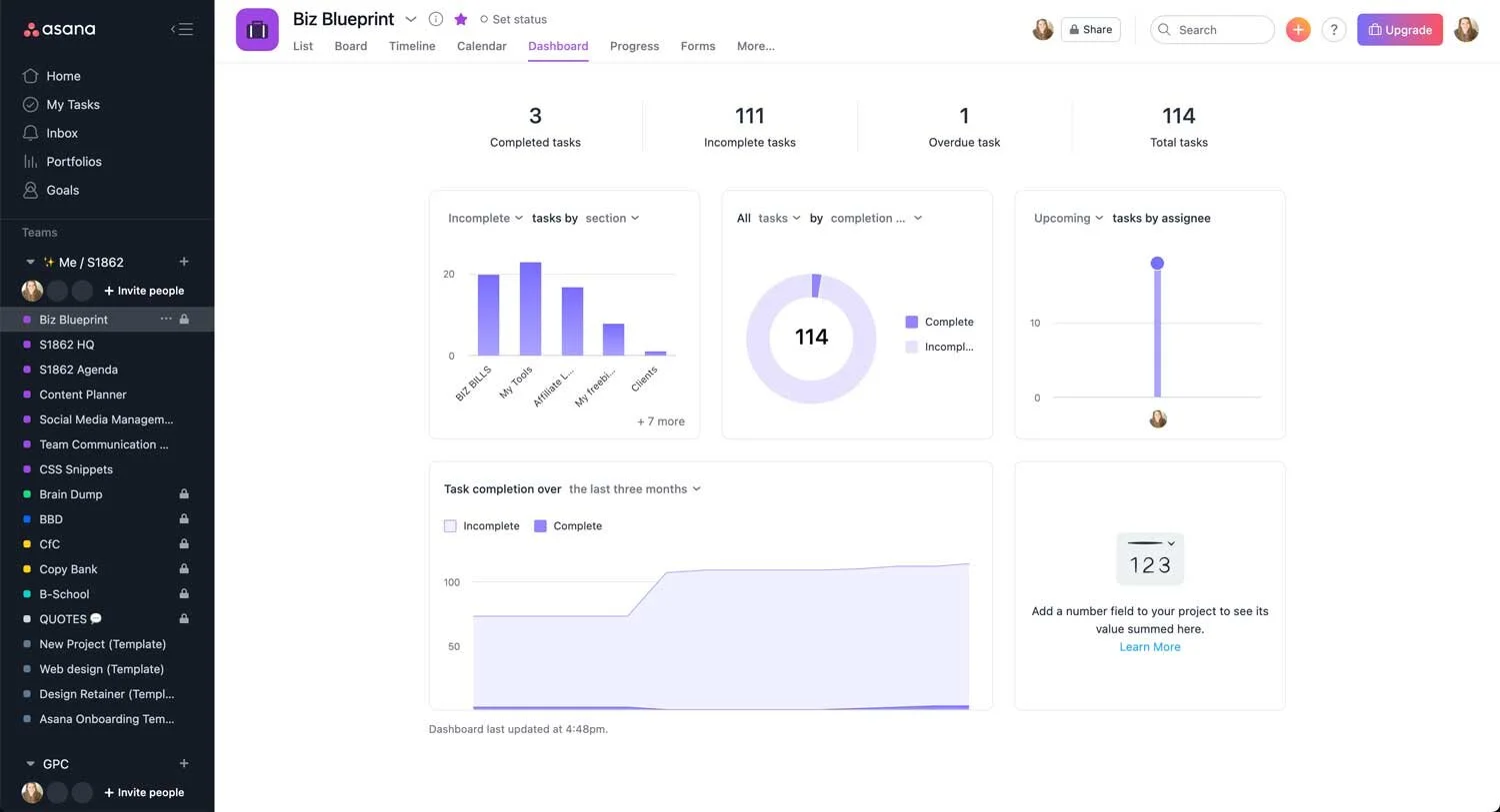
The Timeline feature (Gantt chart), progress insights, and forms are all paid features.
USABILITY
Everything is drag & drop. There are lots of keyboard shortcuts, and everything is in a clear place that makes sense. All of your lists are on the right, and you can easily filter out all tasks assigned or not assigned to you. You can also save your searches as ‘reports’ making them easy to search again, but with updated stats. I love the form feature for client projects; it gives them a seamless place to submit new work requests which is great for retainer clients. Conversations is a great place to help keep all project contact & info in one organized place, and Files shows all uploaded files for this project space in one place, –so we don’t have to use email for everything.
CUSTOMIZATIONS
There are custom fields, priority levels, tags, a set number of backgrounds to choose from, but generally the ability to customize your projects is fairly limited (compared to ClickUp). However, that doesn’t really bother me since it keeps it clear of clutter & less confusing because there are fewer options to hunt down since fewer changes are allowed.
I will use emojis in some list titles to make it stand out in a list when necessary, or pick a tag color that helps draw attention to something in a list view.
VIEWS:
Clickup*
LIMITS:
The free plan just limits your storage & access to a few upper-level features; so I upgraded to the lowest paid plan immediately in order to go “all-in” on the ClickUp universe. Since I’ve never really used the free plan long enough, I can’t tell you exactly how limiting it feels.
USABILITY:
It seems by far the most comprehensive app with the most built-in features. I will definitely go on record and say ClickUp wasn’t intuitive AT ALL for me. I’ve actually “switched” to it 2x, the first of which was touch-and-go and I ended up going back to Asana. I know that goes against the grain, because it’s one of the most widely used & most popular, aside from Trello & Asana.
ROUND 1:
In 2016/2017, I used their importing process to bring content over from Trello which was mostly automatic. After that though, I guess I expected to be able to use the Board views like Trello, –and because of that, it was like I had a mental block on using ClickUp.
I quickly realized ClickUp has a lot of power under the hood and it became a puzzle that I needed to work out, regardless of whether I liked the platform or not. 😂 I played with it until I figured out basically how to use ClickUp & took Jessica Stansberry’s “A Course About ClickUp” which was super quick & cheap. ClickUp has great support too, plus tons of tutorial videos & other help docs. At one point I even met with a ClickUp team member for a 1:1 training session!
It is a little slow to load each page, but it’s something I got used to & with all the features that are available, that wasn’t a deal breaker for me.
I tried using ClickUp half-heartedly on and off (while trying all of these others) over about 2-3 years, because I could never fully wrap my head around it. If I didn’t use it for a week, I’d forget where things were. I’d add projects in wrong places & viewing the project info the way I wanted was hard because I had to set the statuses just right. Once I even accidentally created a whole other Workspace which caused a 2nd billing, just because I didn’t realize what I was doing. (They refunded me immediately & were happy to help me, though!)
ROUND 2:
In early 2022, I’d been using Notion and while I love Notion it wasn’t capable of doing things I now needed these many years later. So I went back to ClickUp. Learning from my first overwhelming (or maybe, underwhelming) experience, I knew I need to really dig in & learn how to use it properly. That’s when I found Layla’s YouTube channel, ProcessDriven. I binged tons of videos, utterly fascinated by how much ClickUp could do that I hadn’t known before or that had changed in the years since I’d last tried it.
I joined Process Driven’s membership* (see my review, here) and could not recommend it enough! Layla’s courses inside the membership are fantastic! She’s a vetted ClickUp-approved consultant and she knows her shit up, down, forward & backward. I loved it so much that I eventually decided to become a ProcessDriven affiliate for both their ClickUp course AND their membership!
If you’re interested in using ClickUp for your business but are feeling overwhelmed with learning it, –learn from Layla inside Process Driven Not only does she teach how to use ClickUp efficiently and in ways I’d never even thought of, but she also teaches how to organize generally speaking in a more efficient way, before even bringing the information into the app.
So, yes: ClickUp is feature-rich, but the learning curve was a bit steep for me and it took 2 tries before it finally “clicked.” (Pun intended.)
They do have an app for desktop & mobile, so you can edit in detail or on the go, easily.
CUSTOMIZATIONS:
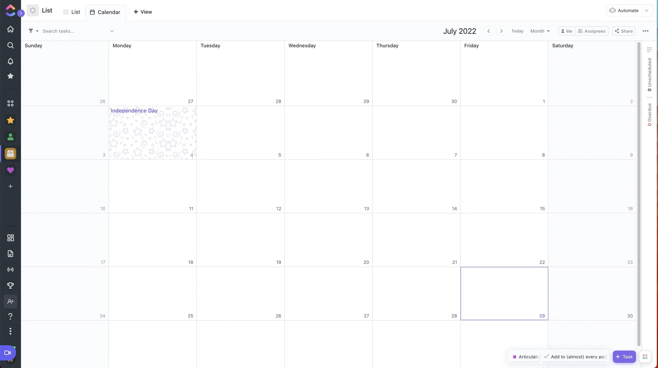
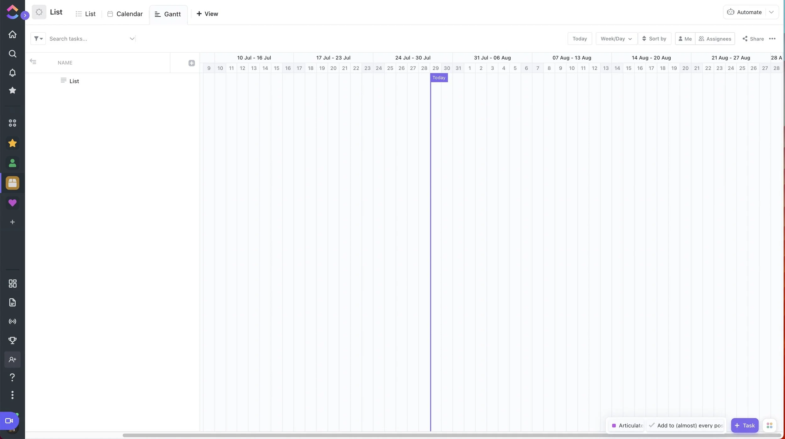
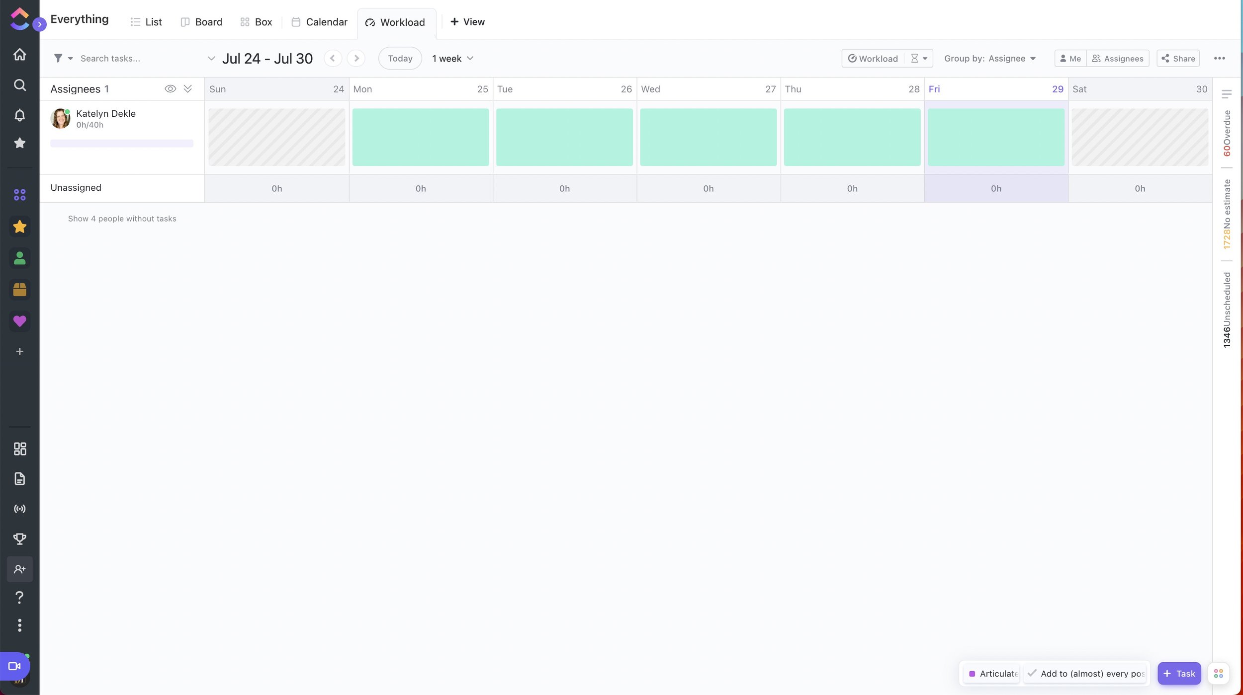
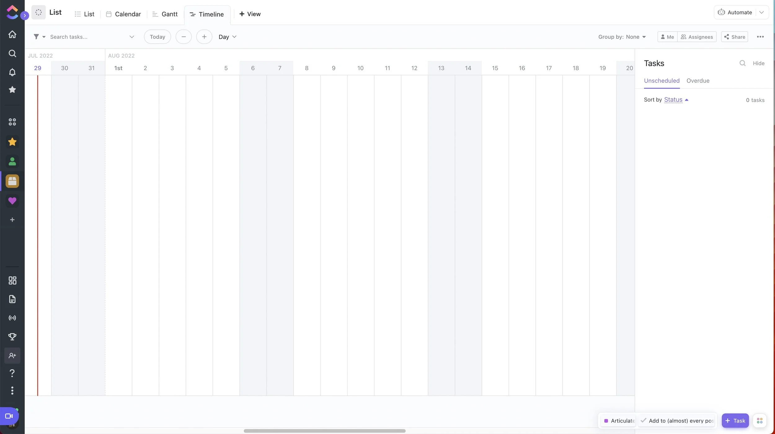
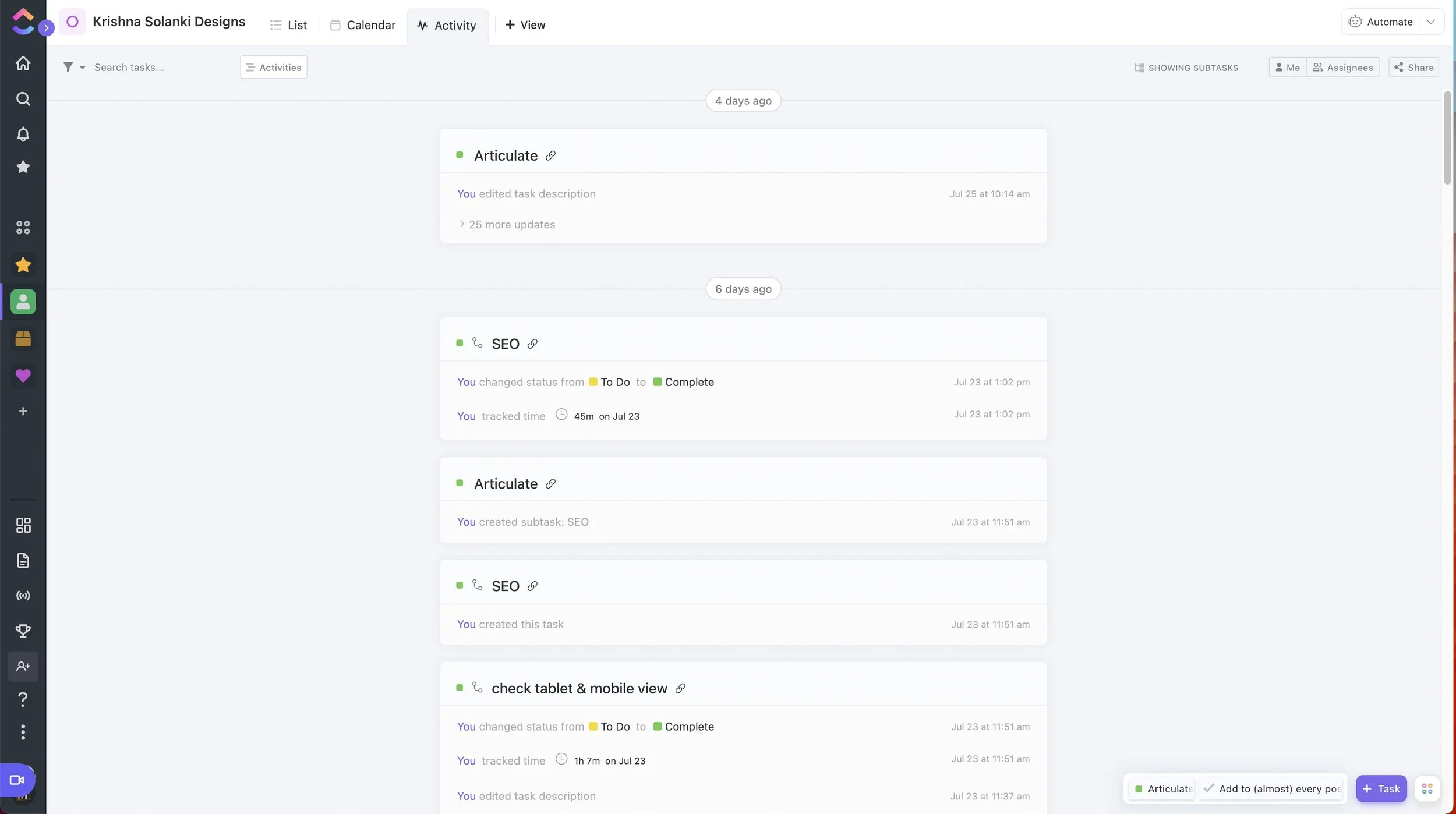
ClickUp wins on the ability to customize the viewing experience, between all the different views (10+) for each list and custom dashboards with widgets to display your information in all kinds of new ways. You can even choose your own status colors with HEX codes to match your branding.
VIEWS:
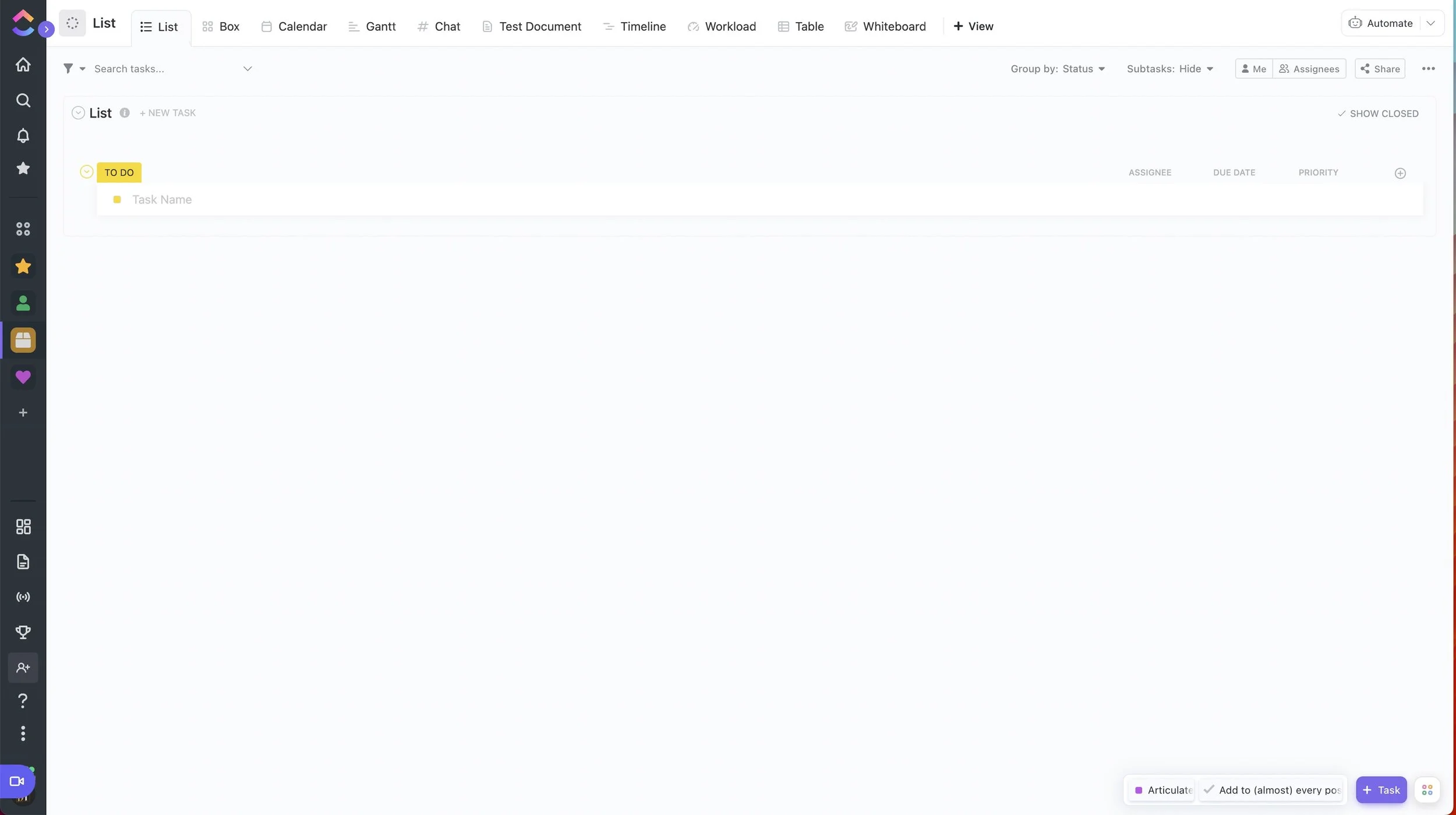
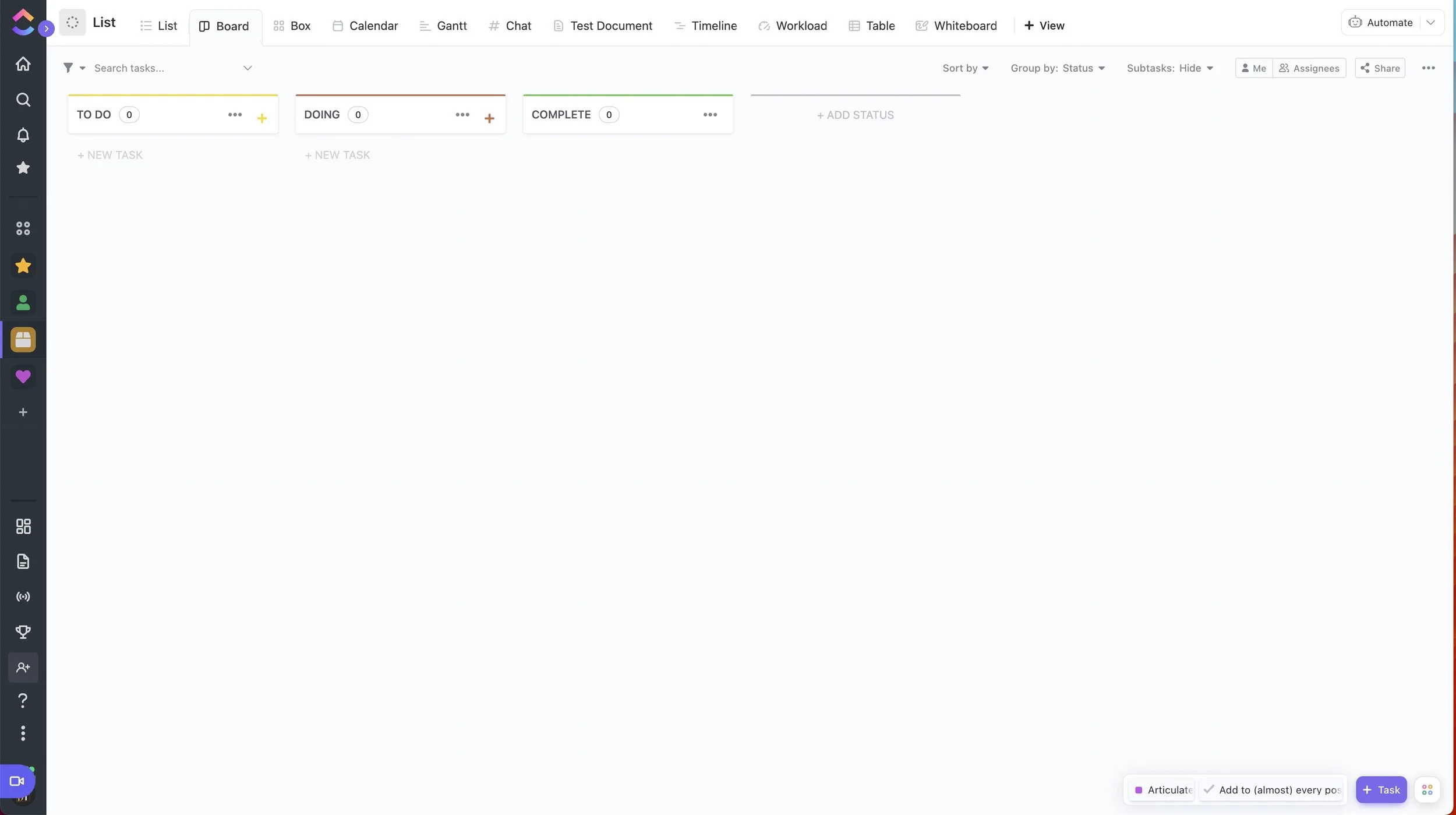
3 main views included on the free plan:
List
Board
Calendar
8 more views, either not included or with use-based limitations on the free plan
Gantt
Timeline
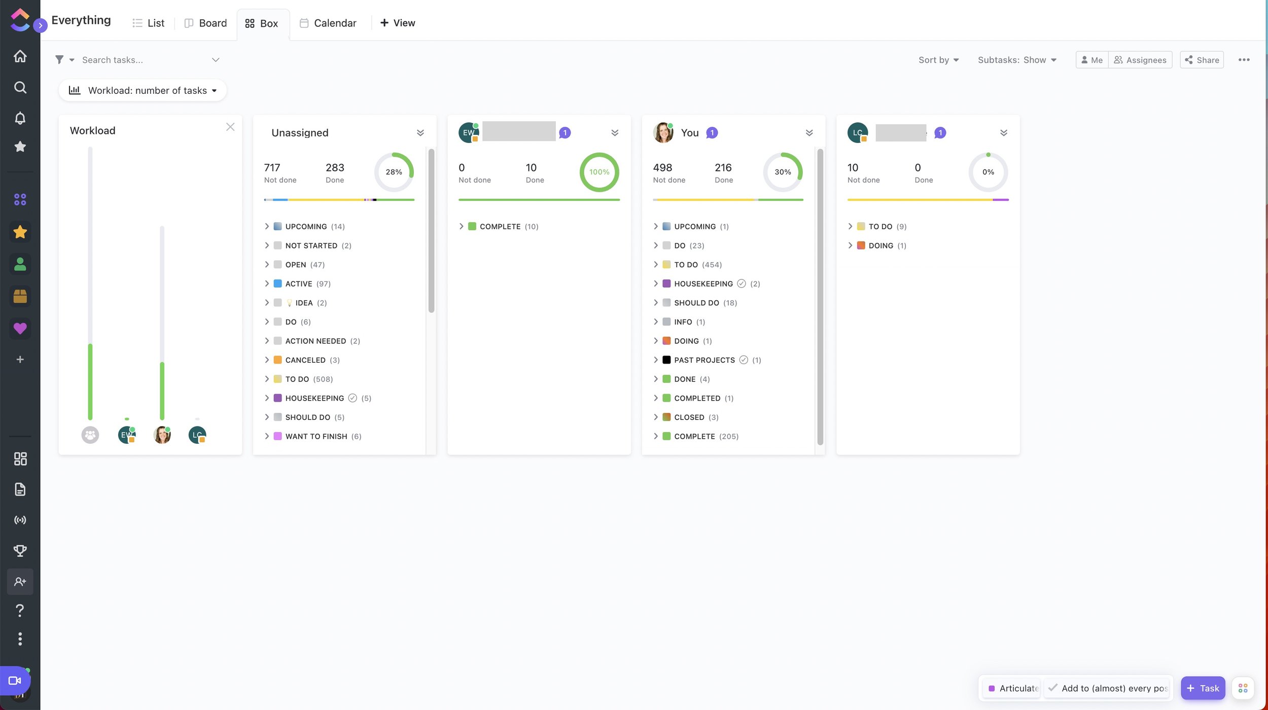
Box
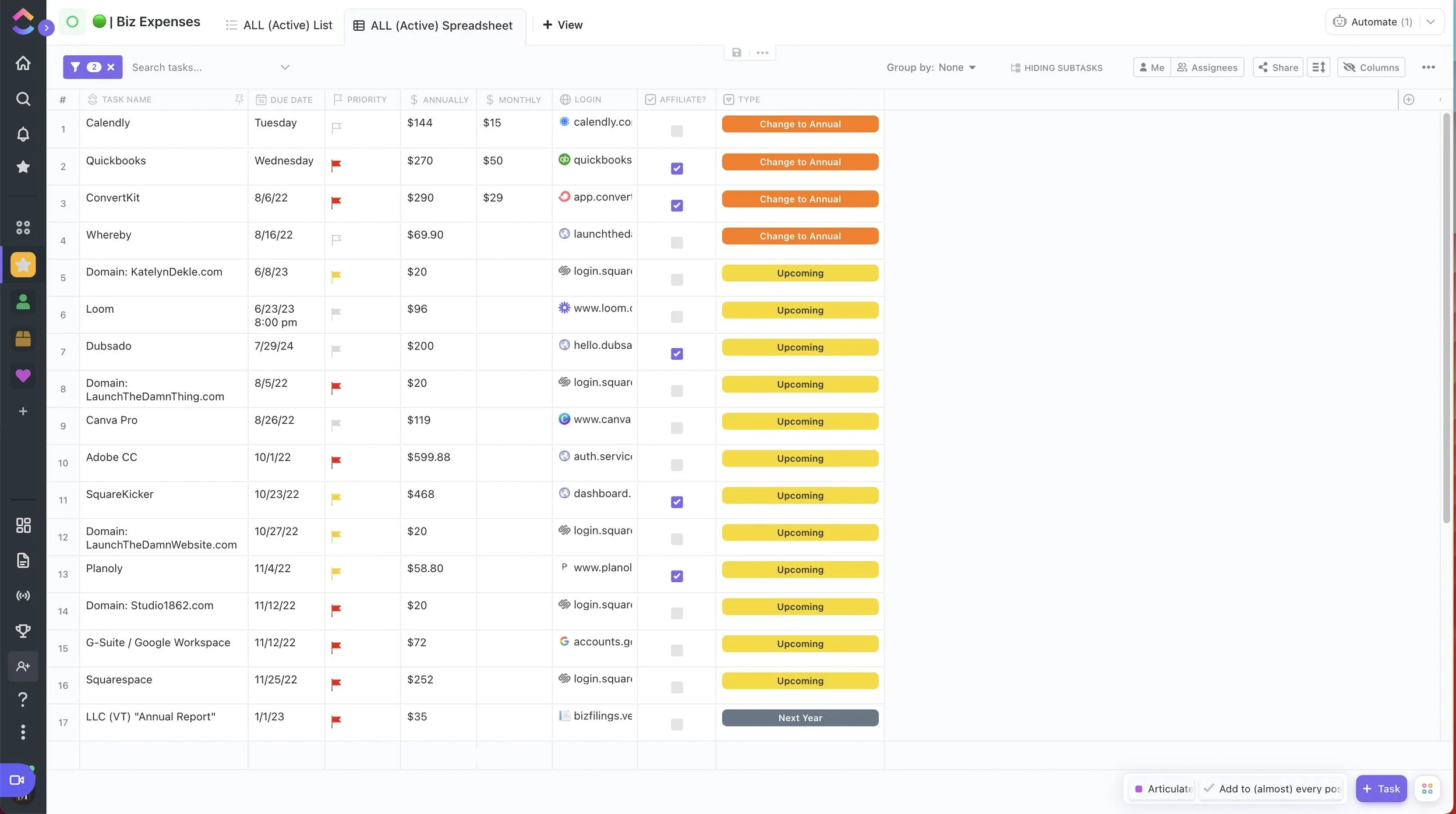
Table
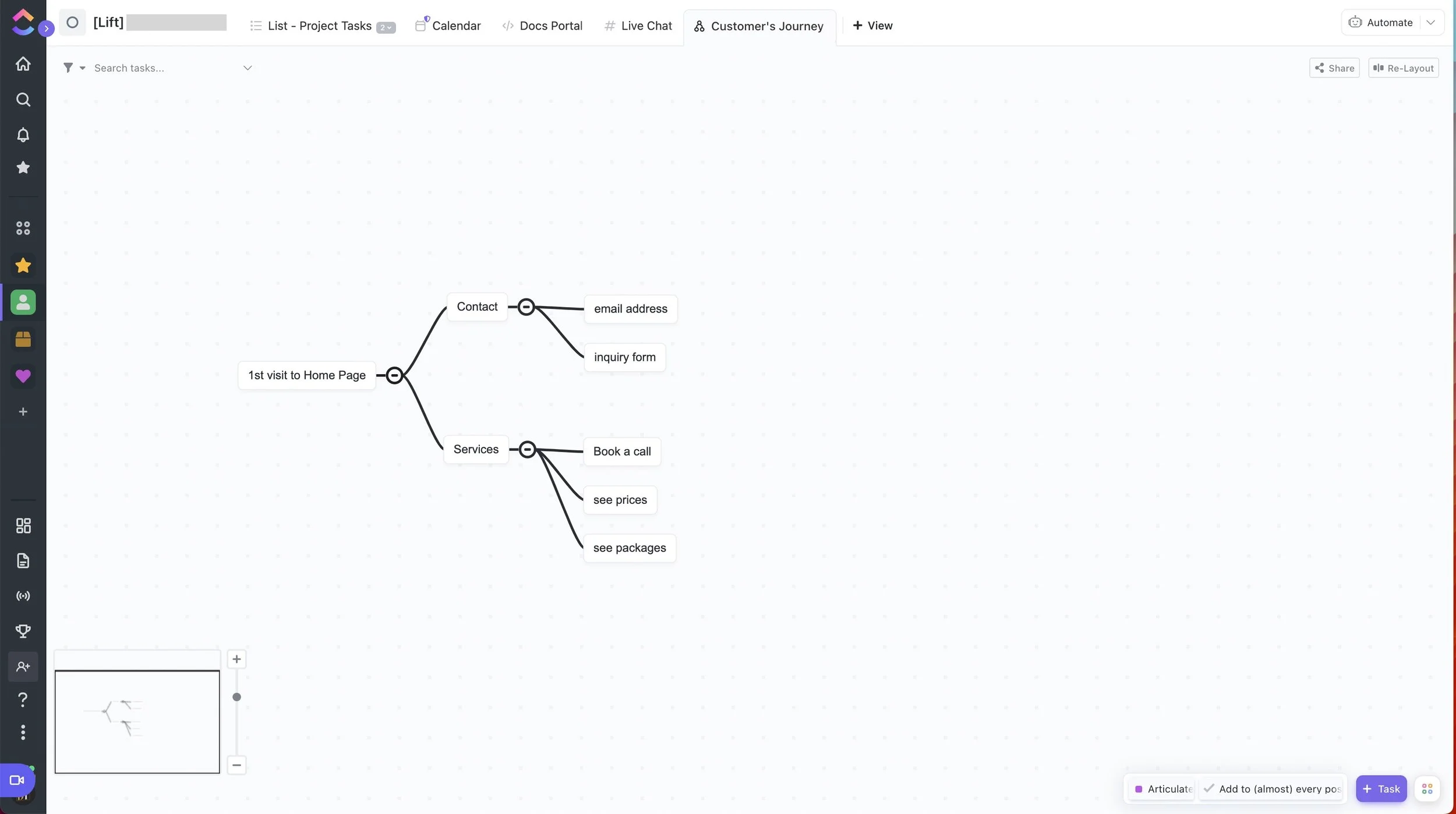
Mindmap (can be task-based or separate information not related to tasks)
Workload
Activity
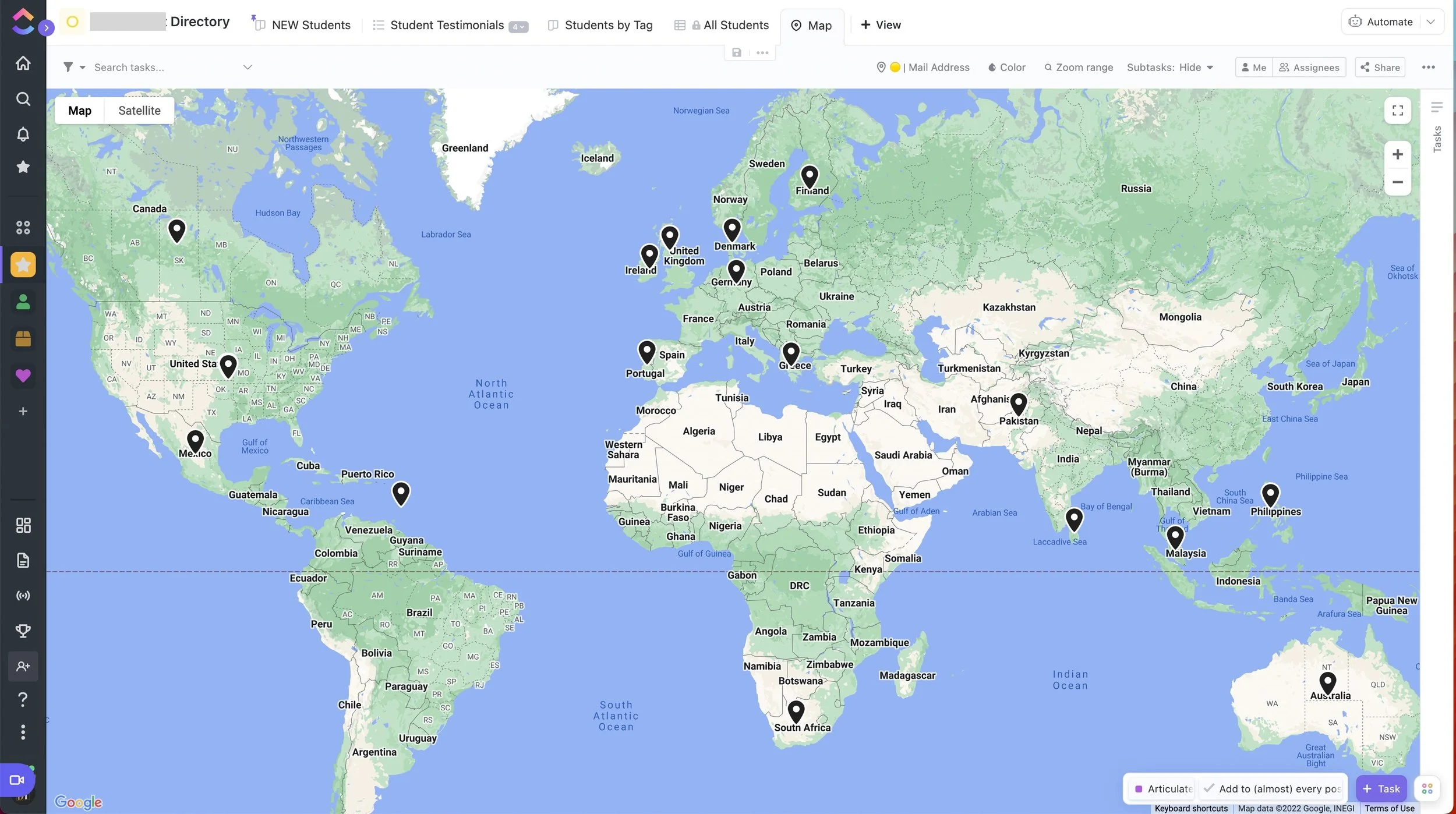
Map
5 more views that are all about displaying or collecting other information, not necessarily on the free plan:
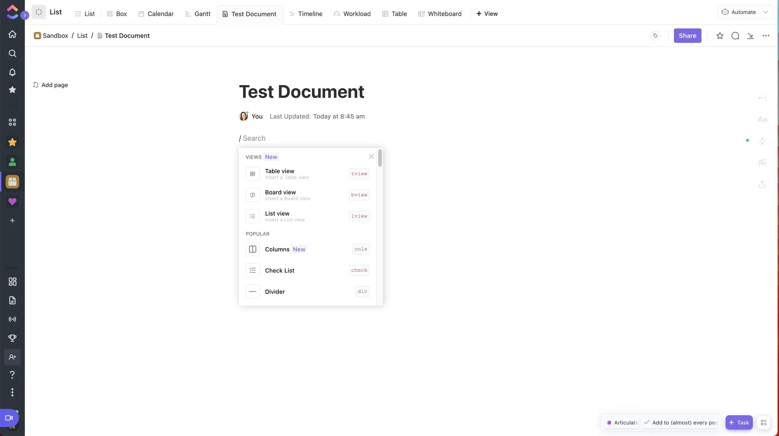
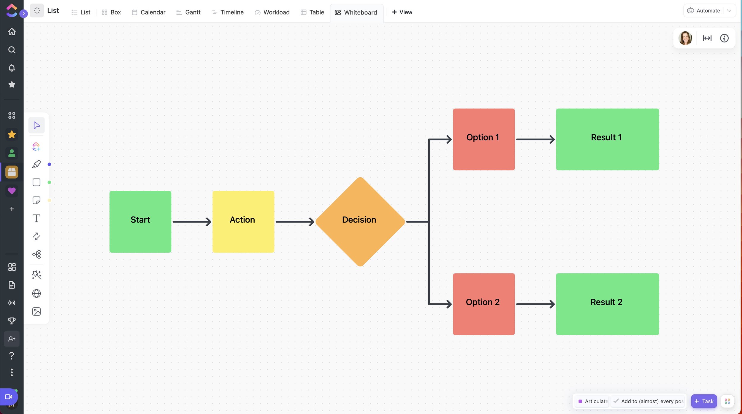
Whiteboard (can be task-based or separate information not related to tasks)
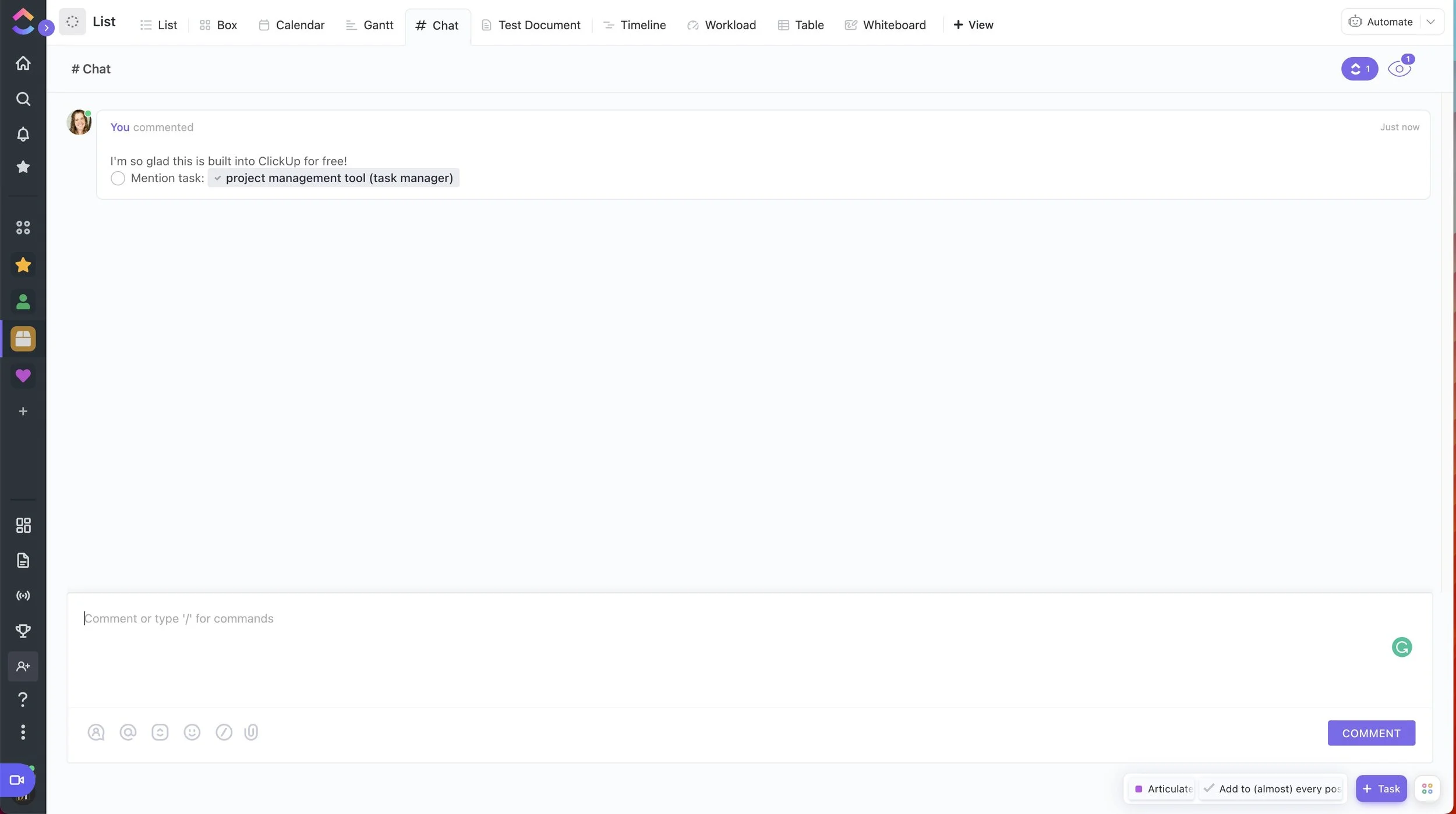
Live Chat
Document
Embed (Google Docs, Sheets, YouTube, HTML, etc)
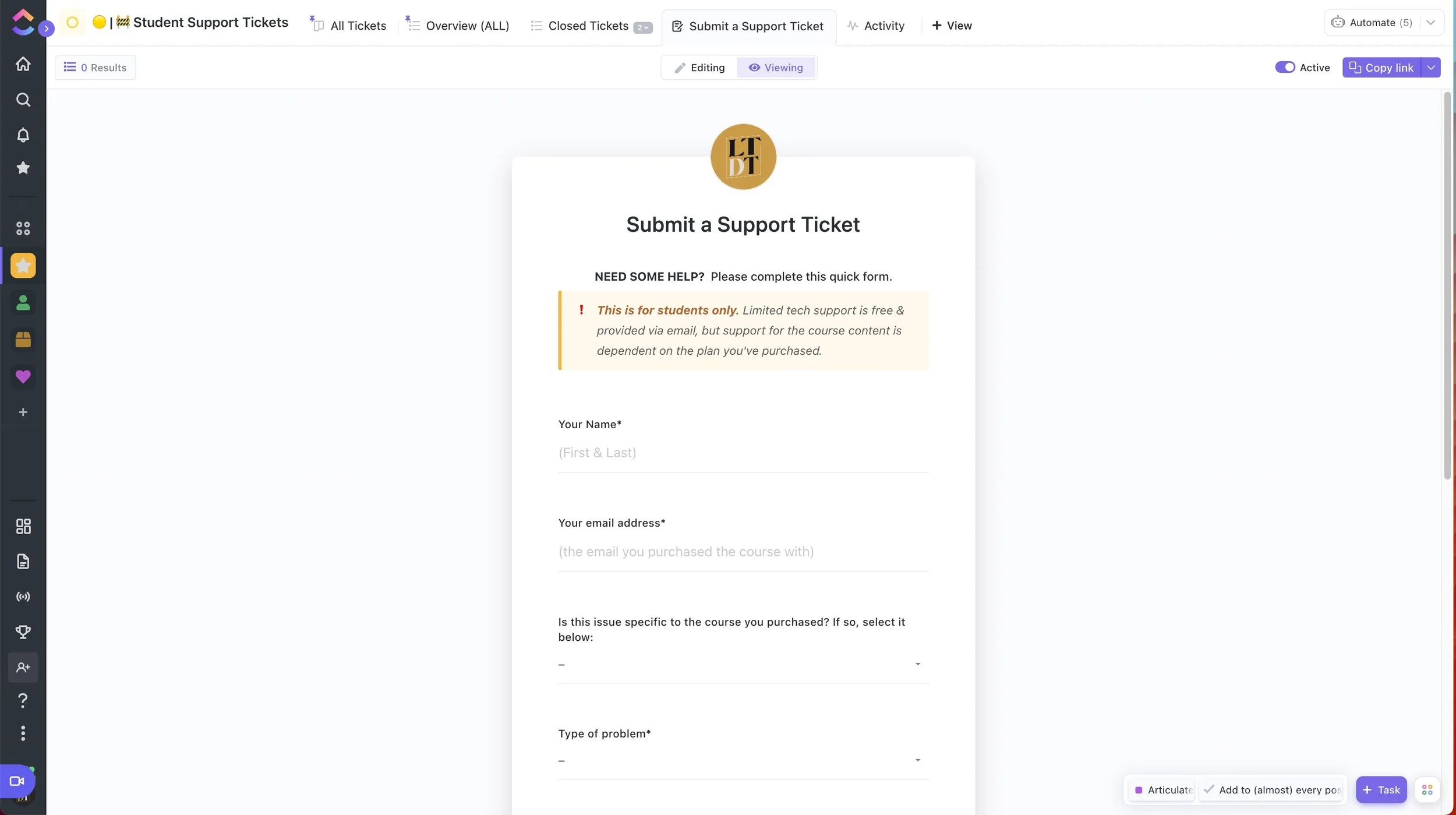
Forms (can be embedded anywhere & submitted information maps to the list where the form was created)
Trello
LIMITS:
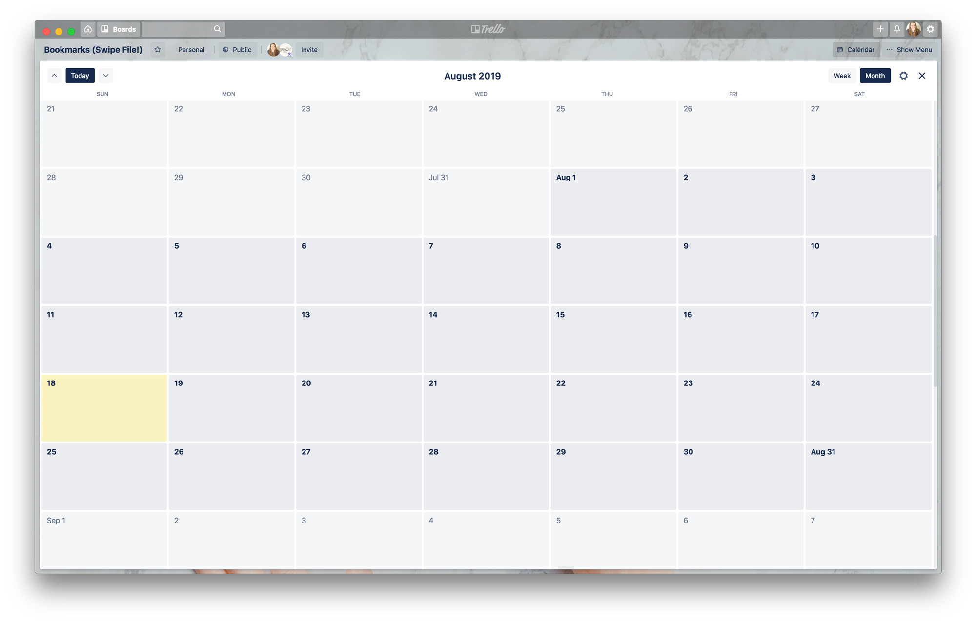
Calendar view is per board, only––which is kind of a big deal. There are ways to get around this, but the fact that we’d have to use Planyway’s PowerUp (you only get 1 PowerUp/Integration per board on the Free plan) to view all due dates on all cards, across all boards, or rig the platform with Butler actions to auto-duplicate/move/copy cards to a specific Calendar board to be able to have a ‘global calendar’ view ––isn’t great.
One due date per task, so no start & end dates for the project itself, unless you create a card/task for each. It does allow you to add times to the due dates.
You only get 1 PowerUp/Integration per board, on the free plan, as stated above. So if you want to link Slack, Google Drive/Dropbox, a Calendar, and Custom Fields, you’ll need a paid plan. They do have lots of fun Integrations & cool ad-ons in the PowerUps though, so it may be worth the upgrade.
They do have an app for desktop & mobile, so you can edit in detail or on-the-go easily.
USABILITY:
Trello seems by far, the easiest to learn how to use. It’s all drag-and-drop. It only has 1 view, in the traditional Kanban (column lists) style, plus a Calendar View if you’re using that PowerUp.
The system is super simple: Each board (project/space) has column lists, and each list has a series of cards/tasks.
You can click any task to open it & that’s where all the good stuff goes: due dates, labels/statuses, members/teammates/assignees, comments, attachments, activity log per task, descriptions, checklists for that task, etc.
CUSTOMIZATIONS:
Trello allows more minor customizations.
Examples:
On the free plan you can pick a color background or a photo from the Unsplash library (free stock photos). On the paid plan you can upload any image you want for a background.
Trello’s labels/statuses are a specific set of colors, not changeable that I’m aware of, except in name or viewed in Colorblind Mode.
You can “decorate” your lists by adding bogus/empty cards at the top & giving them an attachment that shows up on the card’s face, which can allow you to add image or color labels to your lists that you design yourself.
Other than that, you’d need PowerUps to further customize, with things like Custom Fields, etc. The platform itself doesn’t allow much alteration, but within your boards you can play to make it feel like your own.
VIEWS:
Airtable
You can kind of get a feel for Airtable from the spreadsheet I’ve embedded above. That was created on that platform. While they have other views, I’ve only ever used their spreadsheet/grid view myself so I can’t speak from experience on their other offerings.
I do know they have bank-level encryption, so your info will be secure there, which is always a great thing to know as a business owner.
They do have an app for desktop & mobile, so you can edit in detail or on-the-go easily.
Zenkit
Zenkit felt like Asana + Trello + Airtable combined. The one thing I love about Zenkit is the Mind Map feature! It’s on their free plan, too. So it’s great for mapping out processes & automations, especially with things like Dubsado Workflows.
It also handles spreadsheet style views like Airtable, list views like Asana and Kanban/Board views like Trello, plus a global calendar (huge plus!), and image attachments that show on the face of the card without opening it (in board view, like Trello).
Zenkit offers a lot of process customizations, like filtering, and how much information shows in the list/board/spreadsheet view at a glance. It also allows custom fields on the free plan, which is great if you have the need to add multiple dates (start/end) and other things like that.
They do have an app for desktop & mobile, so you can edit in detail or on-the-go easily.
VIEWS:
Here you can actually see how Zenkit imported my Trello Bookmarks Swipe File board. It imported all of that information, but compared to how it’s laid out in Trello, it’s a lot more visually disorganized in Zenkit. Not that it couldn’t be fixed, but I haven’t been motivated to do so when it’s fine in Trello, currently. I really only need it in one place, after all. 🙂
Mind Map View
Quire
Quire is very simple. It does some complex things, but it’s user-experience is VERY plain & clean & simplistic.
If you need a lot of white space, but still want to see your project information in a few different ways, and have some of the power that comes with the platforms above, then Quire might be a good fit.
The best part? It’s ALL free. All of the features they offer are free until some time in 2020, so go ahead & create your account now to take advantage.
They have a mobile app, so you can edit in detail through the web app or on-the-go easily.
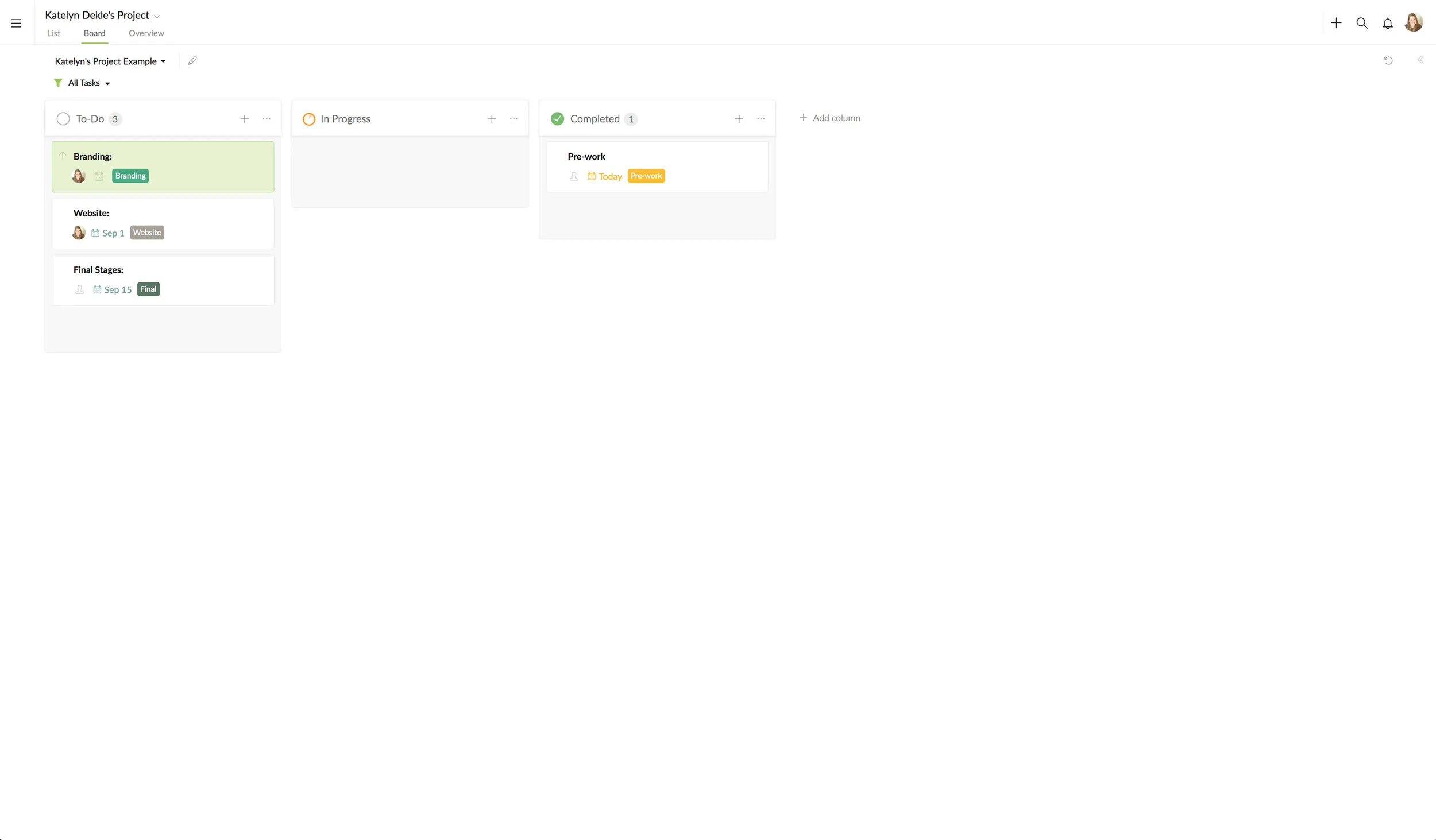
VIEWS:
One note that’s not immediately obvious in Quire: you have to add listed tasks to the board view, in order for them to show up there. To do that, you select the main task (Branding, in this example), and in the little side/pop out for that task group, there’s a Kanban icon at the top. It’s grey when it’s inactive & green when you’ve added it to a board view.
Milanote
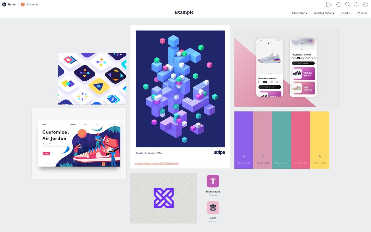
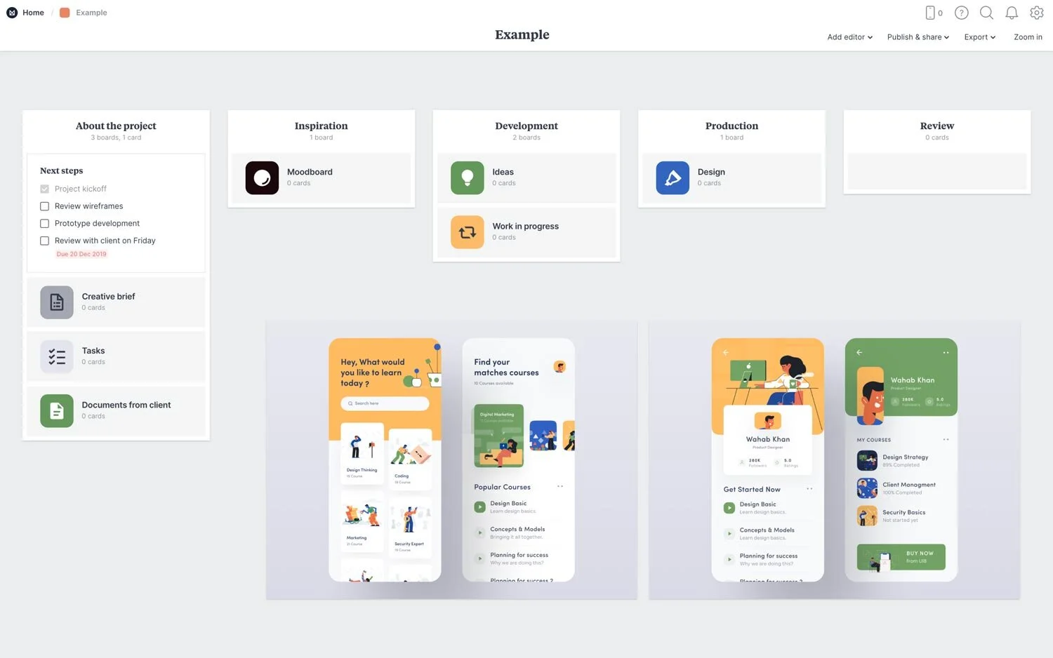
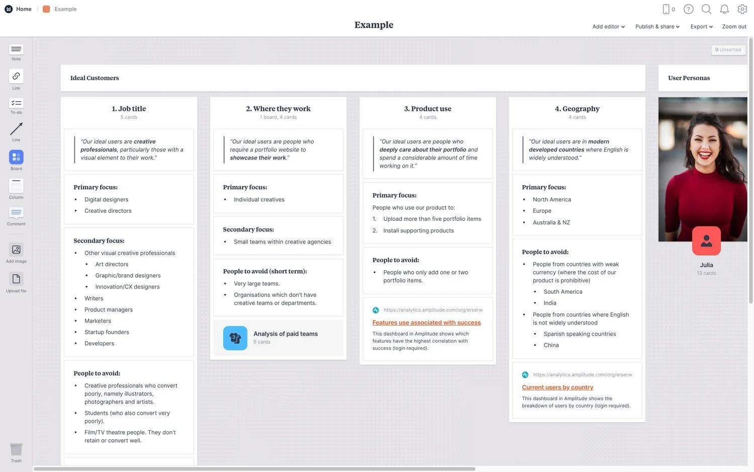
This one is VERY different from all the rest. Milanote is literally a blank slate & YOU make it what you want it to be.
There’s a sidebar on the left with tools & block-like elements you can add (if you’re a Squarespace user, this will feel pretty familiar to you) with individual design/display/use settings for each element you add. You click & drag the elements you want onto the empty space on the right. You can style it to match your brand, make it totally messy, align everything perfectly, overlap things, and more.
It works especially well for building workflows and automations in a mind-map style like you would with post-it notes on a whiteboard with arrows to visualize the flow.
They do have an app for desktop & mobile, so you can edit in detail or on-the-go easily.
LIMITATIONS:
Because it’s a build-it-yourself type of platform, there aren't really any stats, so it’s not great if you want to be able to see reports on progress made.
VIEWS:
Here are some examples of some of their board templates, and what the dashboard looks like:
That’s it for today, folks! 😂 I can’t pack in any more information into one post –in fact, this probably should’ve been several DIFFERENT posts. But, whatever!
If you have something to add or correct, let me know in the comments!


